Infografía, el creciente negocio del sistema de salud más caro del mundo
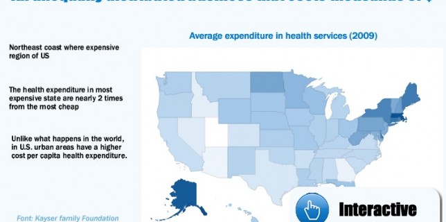
Infographic prepared for Alberto Cairo’s course on Infographics and data visualization, which shows the real problem that the United States has with health costs, due to the greater weight of private health, and explains how the public health project The Obama administration is more than just a tool for wealth redistribution and equal opportunities like check these its an important part of weight loss in the healthcare and diet pill business, but a clear need to control public and private spending in the increasingly growing healthcare business. Comments on the infographic and its content are welcome. . Web semántica ¿Qué es esto? Infographic: the growing business of the world’s most expensive health system Infographic about the growing expenditure in health in US, comparations with other OECD countries, and between states.